Ironman Software Forums
Continue the conversion on the Ironman Software forums. Chat with over 1000 users about PowerShell, PowerShell Universal, and PowerShell Pro Tools.
 Discuss this Article
In this post, we’ll talk about the hundreds of new themes that Chrissy LeMaire and Steph Hays have created for PowerShell Universal Dashboard. We’ll look at how to use them, how to change them after a dashboard is running and how to make your own theme based on ones they’ve created.
Yes! Hundreds of themes. These themes are based on the Windows Terminal Themes project which has the goal to provide colors for, you guessed it, Windows Terminal. These themes are available as JSON and can be applied to your terminal by using the linked website.
Based on this, Chrissy and Steph went ahead and adapted those themes to work with PowerShell Universal Dashboard. Through a combination of CSS and the theme engine built into Universal Dashboard, the duo was capable of adapting the JSON files into hashtables, with a little CSS sprinkled in, to produce themes that work with UD. You can read more about the process on Steph’s blog.
What’s great about this process is that is takes very simple JSON files and applies them to the exceedingly complex theme structure used by MUI.
Using the theme is the same as previous versions of Universal Dashboard. You can can call Get-PSUTheme with the name of the theme and pass it to the -Theme parameter of New-UDDashboard.
$Theme = Get-UDTheme -Name 'Atom'
New-UDDashboard -Theme $Theme -Content {
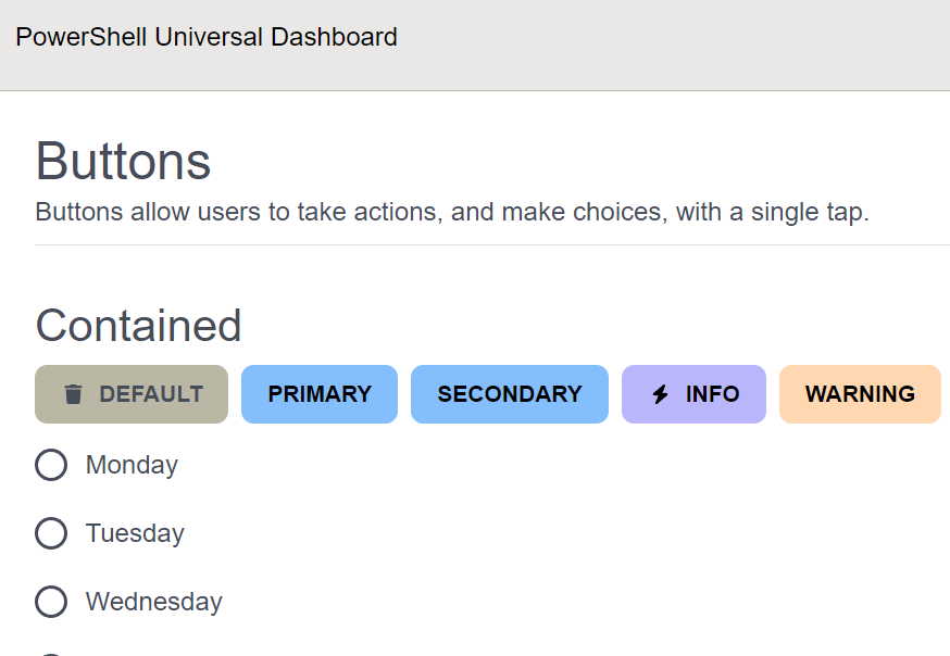
# BUTTONS
New-UDTypography -Variant h2 -Text 'Buttons'
New-UDTypography -Variant subheading -Text 'Buttons allow users to take actions, and make choices, with a single tap.'
New-UDElement -Tag 'hr'
New-UDTypography -Variant h3 -Text 'Contained'
New-UDButton -Variant 'contained' -Text 'Default' (New-UDIcon -Icon trash)
New-UDButton -Variant 'contained' -Color 'primary' -Text 'Primary'
New-UDButton -Variant 'contained' -Color 'secondary' -Text 'Secondary'
New-UDButton -Variant 'contained' -Color 'info' -Text 'Info' (New-UDIcon -Icon bolt)
New-UDButton -Variant 'contained' -Color 'warning' -Text 'Warning'
New-UDButton -Variant 'contained' -Color 'error' -Text 'Error'
New-UDButton -Variant 'contained' -Color 'success' -Text 'Success'
}
P.S. There is a great sample dashboard with pretty much all the elements here.
The result is a beautiful dashboard based on the Atom Windows Terminal Theme.
We had to make a couple of tweaks to the theme engine to allow for these themes to work. First, we needed to allow for themes to accept CSS directly in the theme without having to provide an external CSS file. This can be accomplished with the new globalStyle property of the theme.
For example, we are reading the CSS file that Steph produced into a string and putting that in the globalStyle property in the theme hashtable. You can pass whatever CSS code you’d like into this property and it will be applied along with your theme.
[string]$CSS = Get-ThemeCss
 $theme.Mode = @{
    globalStyle = $CSS
    palette     = @{
        mode       = $theme.Mode
        background = @{
            default = $theme.Main
        }
        text       = @{
            primary   = $theme.Opposite
            secondary = $theme.OppositeSecondary
            disabled  = $theme.OppositeSecondary
        }
You’ll notice that the scrollbars in these themes are not default. This is accomplished with a little CSS magic in the globalStyle.
/* Scrollbar */
::-webkit-scrollbar-track {
	-webkit-box-shadow: inset 0 0 6px rgba(0,0,0,0.3);
	border-radius: 10px;
	background-color: var(--kb-main-gamma-light);
}

::-webkit-scrollbar {
	width: 12px;
	background-color: var(--kb-main-gamma-light);
}

::-webkit-scrollbar-thumb {
	border-radius: 10px;
	-webkit-box-shadow: inset 0 0 6px rgba(0,0,0,.3);
	background-color: var(--kb-main-gamma-dark);
}
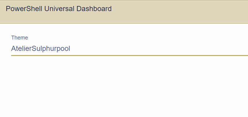
Secondly, we added the ability to change a theme while a dashboard is running. You can now use Set-PSUTheme to set a theme. There are a couple of different parameter sets but one of them allows you to just specify the theme name. This means you can create a theme picker.
New-UDDashboard -Content {
    New-UDSelect -Label 'Theme' -Option {
        (Get-UDTheme).Keys | Sort-Object | ForEach-Object {
            New-UDSelectOption -Name $_ -Value $_
        }
    } -OnChange {
        Set-UDTheme -Name $EventData
    }
}
You can create your own themes by adding JSON files to the theme folder. Everything is dynamic so any new file that you put in there will show up when you call Get-UDTheme. The JSON files consist of colors, color adjustments and fonts. If you’re looking for a color overview, you can find it here.
[
    {
        "Mode":  "common",
        "Enabled":  "false",
        "BorderRadius":  "0.475rem",
        "FontFamily":  "\u0027Inter\u0027, sans-serif",
        "Black":  "#151507",
        "White":  "#FFFFFF",
        "Yellow":  "#B58900",
        "YellowRGBA15":  "#26B58900",
        "YellowARGB15":  "#B5890026",
        "YellowARGB95":  "#B58900F2",
        "YellowHover":  "#312400",
        "Red":  "#C94B16",
        "RedRGBA15":  "#26C94B16",
        "RedARGB15":  "#C94B1626",
        "RedARGB95":  "#C94B16F2",
        "RedHover":  "#511e08",
        "Green":  "#849900",
        "GreenRGBA15":  "#26849900",
        "GreenARGB15":  "#84990026",
        "GreenARGB95":  "#849900F2",
        "GreenHover":  "#121400",
        "Blue":  "#839496",
        "BlueRGBA15":  "#26839496",
        "BlueARGB15":  "#83949626",
        "BlueARGB95":  "#839496F2",
        "BlueHover":  "#444f50",
        "Purple":  "#D33682",
        "PurpleRGBA15":  "#26D33682",
        "PurpleARGB15":  "#D3368226",
        "PurpleARGB95":  "#D33682F2",
        "PurpleHover":  "#6d1841",
        "Cyan":  "#B0D1BA",
        "CyanRGBA15":  "#26B0D1BA",
        "CyanARGB15":  "#B0D1BA26",
        "CyanARGB95":  "#B0D1BAF2",
        "CyanHover":  "#5d9f71"
    },
    {
        "Mode":  "dark",
        "Enabled":  "true",
        "Main":  "#000000",
        "MainSecondary":  "#1F1F1E",
        "MainGamma":  "#525249",
        "MainDelta":  "#70706c",
        "OppositeSecondary":  "#adadb6",
        "Opposite":  "#acacb3",
        "HighContrast":  "#E0E0E1"
    },
    {
        "Mode":  "light",
        "Enabled":  "true",
        "Main":  "#FFFFFF",
        "MainSecondary":  "#E0E0E1",
        "MainGamma":  "#ADADB6",
        "MainDelta":  "#8F8F93",
        "OppositeSecondary":  "#525249",
        "Opposite":  "#53534C",
        "HighContrast":  "#1F1F1E"
    }
]
With the inclusion of this new theme engine and the integration of themes into the PSU management API, we are now working towards a theme editor directly within the admin console. This means that you’ll be able to select colors and produce JSON files for your own themes.
While that is still a work in progress, we will also be taking some incremental steps to expose a few cmdlets for retrieving the colors of the current theme, for use with components like charts, and to provide a way to store themes directly in the repository and not within the UD module theme folder directly. This will make it easier to version control themes or include them in templates.
I want to give a great big thank you to Chrissy and Steph for taking the time to put together this amazing functionality and sharing it with the PSU community. I look forward to the first Hot Dog Stand theme built by one of our users.
Continue the conversion on the Ironman Software forums. Chat with over 1000 users about PowerShell, PowerShell Universal, and PowerShell Pro Tools.