Ironman Software Forums
Continue the conversion on the Ironman Software forums. Chat with over 1000 users about PowerShell, PowerShell Universal, and PowerShell Pro Tools.
 Discuss this Article
Universal Dashboard is an extensible web framework for building pages with PowerShell. You can use PowerShell functions to define the layout and actions a user can take on the web page. In this post, we will look at how to define new, custom components with PowerShell and JavaScript.
To get started, it’s recommended to have the following installed.
After those are installed, you will want to create a new repository based on the Universal Dashboard Component template repository.
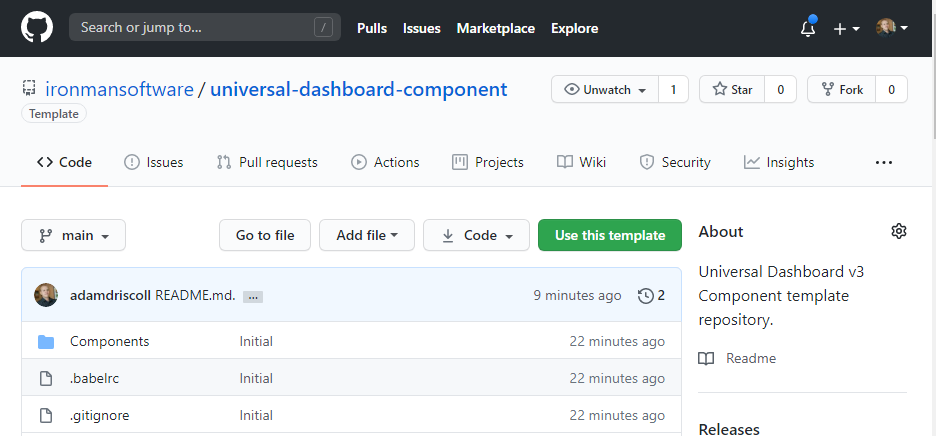
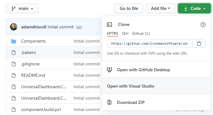
Once your repository has been created, you can clone it using your tool of choice.
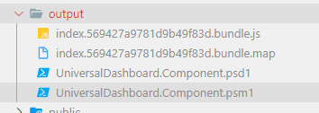
Now that you have the code local, you can run Invoke-Build within the source folder. It will install the NPM packages and build the component. You should have an output folder that has the PowerShell and JavaScript files included. These are the files that you will publish to the PowerShell Gallery and import into PowerShell Universal.
To load the component into a PowerShell Universal dashboard, you can use the VS Code extension to edit the dashboard.components.ps1, dashboards.ps1, and dashboard file to include the component and set the properties of the component.
Within this file, we will register the component with Universal. You should point to the output folder.
New-PSUDashboardComponent -Name "UniversalDashboard.Component" -Path "C:\src\UD-95\output" -Version "1.0"
This file is used for configuring the settings of dashboards. You will need to include this component with the dashboard.
New-PSUDashboard -Name "db3" -FilePath "db3.ps1" -BaseUrl "/dashboard" -Framework "UniversalDashboard:3.0.3" -Component @("UniversalDashboard.Component:1.0")
This is the file that contains the guts of the dashboard. We will want to use our component within this script.
New-UDDashboard -Title "Hello, World!" -Content {
    New-UDComponent -Text 'Hello'
}
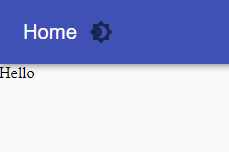
If we were successful, you will see the text within the dashboard.
Almost all the custom components within Universal Dashboard are wrappers around existing React libraries. You may find a cool React component that you’d like to use in UD and this section will show you how to do it.
In this example, we’ll be using React95. It’s a library of components that look like Windows 95.
To add the library, we will need to use npm to add the record to package.json and download the files to node_modules. From the root of the source directory, run the following command.
npm i react95 styled-components
Once the library has been added, you can import it into your JavaScript component using the import keyword. If we wanted to import the textfield, we could do the following.
import { TextField } from 'react95'
Properties are a core concept of React and Universal Dashboard. When you pass parameters to Universal Dashboard functions, they are serialized to JSON and sent to the accompanying React component.
Let’s create a text field using React95. First, I’ll create a new JSX file within Components folder called textfield.jsx. Then, I’ve added a very basic React component that uses the React95 text field component. We’ll pass in props for the value, placeholder and full width.
We wrap our component using withComponentFeatures to automatically integrate with Universal Dashboard.
import React from 'react';
import { withComponentFeatures } from 'universal-dashboard'
import { TextField } from 'react95';

const UD95Textfield = props => {
  return <TextField value={props.value} placeholder={props.placeholder} fullWidth={props.fullWidth} />
}

export default withComponentFeatures(UD95Textfield)
Next, we’ll need to add a registration for the component in index.js.
import UD95Textfield from './textfield';
UniversalDashboard.register("ud95textfield", UD95Textfield);
Components with Universal Dashboard are created using hashtables. Typically, you’ll want to create a PowerShell function that returns the hashtable so that the user has a good experience using your component. In the PSM1 file, we will add a new function that takes parameters for value, placeholder and the full width.
The asset ID, ID, isPlugin and type are required in the hashtable. The rest of the properties can be optional. Note that the hashtable keys are case-sensitive in JavaScript. Also note that the type value needs to match in PowerShell and within the index.js file.
function New-UD95TextField {
    param(
        [Parameter()]
        [string]$Id = (New-Guid).ToString(),
        [Parameter()]
        [string]$Value,
        [Parameter()]
        [string]$Placeholder,
        [Parameter()]
        [switch]$FullWidth
    )

    @{
        assetId = $AssetId
        isPlugin = $true
        type = "ud95textfield"
        id = $Id

        value = $Value
        placeholder = $Placeholder
        fullWidth = $FullWidth.IsPresent
    }

}
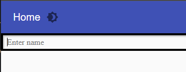
Now that we have updated the component, we can rebuild the project with Invoke-Build. Then, we should use our new component within our dashboard.
New-UDDashboard -Title "Hello, World!" -Content {
    New-UD95Textfield -Placeholder 'Enter name' -FullWidth
}
Now that the new component has been added, we can view it within the dashboard.
One really neat feature of Universal Dashboard is the ability to run PowerShell scripts when a user takes some action with the dashboard. In your custom components, you can hook into this feature using the following method.
Let’s create a new component for a button. Just as we did before, create a new JSX file, update the index.js and add a new function to the PSM1.
In the JSX file, we will need to hook the onClick event handler to the props.onClick function that is provided by Universal Dashboard. When the user clicks the button, it will automatically call the PowerShell script block that was defined.
import React from 'react';
import { withComponentFeatures } from 'universal-dashboard'
import { Button } from 'react95';

const UD95Button = props => {
    return <Button onClick={() => props.onClick()}>{props.text}</Button>
}

export default withComponentFeatures(UD95Button)
Within the PSM1 file, we need to add our function. For the most part, it will be similar to the text field but with one difference; we need to register our script block so that it can be used with the onClick handler.
The OnClick parameter needs to be of the type Endpoint. Script blocks will automatically be converted to Endpoints. You then need to call the Register method of $OnClick and pass in the ID and the $PSCmdlet variable.
function New-UD95Button {
    param(
        [Parameter()]
        [string]$Id = (New-Guid).ToString(),
        [Parameter()]
        [string]$Text,
        [Parameter()]
        [Endpoint]$OnClick
    )

    $OnClick.Register($Id, $PSCmdlet)

    @{
        assetId = $AssetId
        isPlugin = $true
        type = "ud95button"
        id = $Id

        text = $Text
        onClick = $OnClick
    }
}
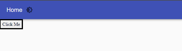
Now we can rebuild the project and add the component to our dashboard.
New-UDDashboard -Title "Hello, World!" -Content {
    New-UD95Button -Text 'Click Me' -OnClick {
        Show-UDToast -Message "Clicked"
    }
}
Once this is done, we can try to use our button.
Some components will render another component within them. This can include components like lists or cards. We can use the React95 list in this example. When we define our components this time, we will take advantage of the render prop that is provided by Universal Dashboard to render other components.
Notice that we have defined two components in a single file. This means we need to export and import them a little differently.
import React from 'react';
import { withComponentFeatures } from 'universal-dashboard'
import { List, ListItem } from 'react95';

const UDList = props => {
    return <List>{props.render(props.children)}</List>
}

const UDListItem = props => {
    return <ListItem>{props.text}</ListItem>
}

export const UD95List = withComponentFeatures(UDList)
export const UD95List = withComponentFeatures(UDListItem)
When registering these list components in index.js, the syntax will look like this.
import { UD95List, UD95ListItem } from './list';
UniversalDashboard.register("ud95list", UD95List);
UniversalDashboard.register("ud95listitem", UD95ListItem);
Within PowerShell, it’s pretty straight forward. We just need to make sure to add a content parameter to New-UD95List.
function New-UD95List {
    param(
        [Parameter()]
        [string]$Id = (New-Guid).ToString(),
        [Parameter()]
        [ScriptBlock]$Content
    )

    @{
        assetId = $AssetId
        isPlugin = $true
        type = "ud95list"
        id = $Id

        children = & $Content
    }
}

function New-UD95ListItem {
    param(
        [Parameter()]
        [string]$Id = (New-Guid).ToString(),
        [Parameter()]
        [string]$Text
    )

    @{
        assetId = $AssetId
        isPlugin = $true
        type = "ud95listitem"
        id = $Id

        text = $Text
    }
}
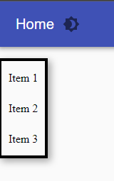
Again, we can build the module and add the script to our dashboard.
New-UDDashboard -Title "Hello, World!" -Content {
    New-UD95List -Content {
        New-UD95ListItem -Text 'Item 1'
        New-UD95ListItem -Text 'Item 2'
        New-UD95ListItem -Text 'Item 3'
    }
}
Any PowerShell errors that you may have will appear within the log tab of your dashboard within the admin console. You can also view errors in VS Code by right clicking on your dashboard and clicking View Log.
To debug JavaScript errors, you can press F12 in your browser when viewing the dashboard to see an errors reported by your script. It should contain a stack trace that indicates the line of where that error is occurring.
In this post, we looked at how to build custom components for Universal Dashboard v3. If you’d like to find the full source code for the module developer here, visit our GitHub repo for UD95.
Continue the conversion on the Ironman Software forums. Chat with over 1000 users about PowerShell, PowerShell Universal, and PowerShell Pro Tools.