Ironman Software Forums
Continue the conversion on the Ironman Software forums. Chat with over 1000 users about PowerShell, PowerShell Universal, and PowerShell Pro Tools.

 Discuss this Article
Universal Dashboard is built on top of MUI. Each UD component, is exposed an advanced function and each of those advanced functions returns a hashtable. Each hashtable requires a couple of different properties which include: type and id. From there all properties are converted to JSON and passed down to the UD client libraries and displayed to the user.
In this post, we’ll look at how to extend the functionality you find in UD components to harness properties of the MUI components that aren’t always available in UD.
Some properties are defined but are do not allow for all the available values provided by MUI.
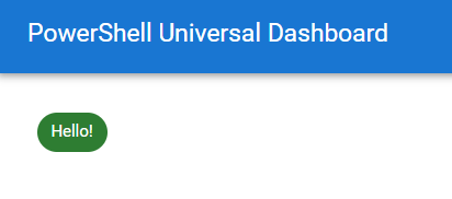
One example, is that the New-UDChip parameter for the color only supports a few of the colors. This isn’t a limitation of any of the technology involved but just a missing feature that will be implemented at some time. That said, you can implement this yourself by returning a hashtable with the correct format.
@{
    id = New-Guid
    type = "mu-chip"
    label = "Hello!"
    color = "success"
}
Each component type is defined within the Universal Dashboard client side library and paired with the advanced function that returns the matching hashtable. You can find the correct type by looking at the definition of the function provided by the UniversalDashboard module.
(Get-Command -Name New-UDChip).Definition

<#
 @{
            #This needs to match what is in the register function call of chips.jsx
            type       = "mu-chip"
            #Eventually everything will be a plugin so we wont need this.
            isPlugin   = $true
            #This was set in the UniversalDashboard.MaterialUI.psm1 file
            assetId    = $MUAssetId

            id         = $Id
            label      = $Label
            icon       = $Icon
            style      = $Style
            variant    = $Variant
            clickable  = $null -ne $OnClick
            onClick    = $OnClick
            delete     = $null -ne $OnDelete
            avatar     = $Avatar
            avatarType = $AvatarType
            className  = $ClassName
            color      = $Color.ToLower()
        }
#>
Property spreading in JavaScript is similar to splatting in PowerShell. You define a JavaScript object and spread the properties across the target component.
For example, the New-UDDrawer component uses the spread operator to set the properties of the MUI Drawer component by using the syntax {...props}.
  return (
    <Drawer {...props} open={props.open} onClose={onClose} key={props.id} id={props.id}>
      <div className={classNames(classes.list, props.className)} role="presentation">
        {props.render(props.children)}
      </div>
    </Drawer>
  )
What’s nice about property spreading is that you don’t need to define each and every property on the component. This allows us to add new properties in PowerShell without having to update the JavaScript library. For example, we can define the hideBackdrop and elevation MUI properties on the drawer in PowerShell even though they currently aren’t implemented in the UD client library.
@{
    type = "mu-drawer"
    id = New-Guid
    open = $true
    hideBackdrop = $true
    elevation = 1
    children = & {
      "Test"
    }
}
One caveat is not all UD components take advantage of spreading which limits the ability of the technique. For example, New-UDButton does not use spreading.
<Button
    variant={props.variant}
    size={props.size}
    disabled={props.disabled}
    className={classNames(classes.button, 'ud-mu-button', props.className)}
    fullWidth={props.fullWidth}
    href={props.href}
    onClick={handleClick}
    style={{ ...props.style }}
    id={props.id}
    color={props.color}
>
    {props.iconAlignment === 'left' ? icon : null}
    {props.text}
    {props.iconAlignment === 'right' ? icon : null}
</Button>
It’s also possible to define your own event handler endpoints for components. While it may be possible to add properties via JavaScript spreading, it’s often easier to wrap the target component in a New-UDElement and subscribe to standard HTML and JavaScript events.
For example, New-UDBadge doesn’t provide any event handlers. The below example allows you to create a badge that you can click.
New-UDElement -Tag div -Attributes @{
    style = @{
      cursor = "pointer"
    }
    onClick = (New-UDEndpoint -Endpoint {
        Show-UDToast "Clicked!"
    }) -Content {
        New-UDBadge -BadgeContent { 4 } -Children {
            New-UDIcon -Icon Envelope -Size 2x
        } -Color primary
    }
}
Find this useful? Please consider sharing this article. Have a question about PowerShell? Contact us and we'll write a post about it.
Continue the conversion on the Ironman Software forums. Chat with over 1000 users about PowerShell, PowerShell Universal, and PowerShell Pro Tools.