Ironman Software Forums
Continue the conversion on the Ironman Software forums. Chat with over 1000 users about PowerShell, PowerShell Universal, and PowerShell Pro Tools.
 Discuss this Article
PowerShell Universal Dashboard v3 is built on Material UI. It provides the component’s functionality along with the look and feel. Universal Dashboard also takes advantage of Material UI’s theme engine. In this blog post, we’ll look at how to create basic themes. We’ll talk about creating light and dark variations. Next, we’ll talk about exercising more control using CSS and the Material UI global class names. Finally, we’ll look at styling individual components with New-UDStyle.
The theme engine in Universal Dashboard is based on the Theming support in Material UI. With Universal Dashboard, you can define a theme by specifying a hashtable with the theme colors and other properties and passing it to the dashboard’s -Theme property.
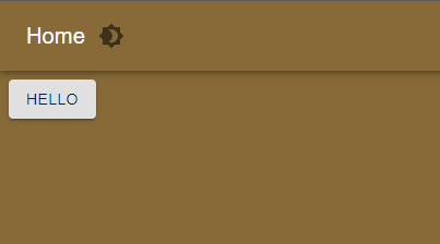
$Theme = @{
    palette = @{
        primary = @{
            main = '#876a38'
        }
        background = @{
            default = '#876a38'
        }
    }
}
New-UDDashboard -Theme $Theme -Title 'Hello' -Content {
    New-UDButton -Text 'Hello'
}
The theme hashtable is serialized to JSON when the dashboard is run and will create a Material UI theme based on the keys and values you provide.
You can see a overview of the format for the theme hashtable by viewing the Material UI Default Theme. You will need to create a hashtable that matches this structure in order to create a theme.
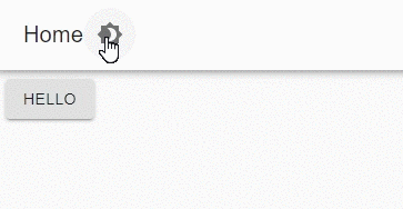
Universal Dashboard and Material UI support a light and dark theme by default. At the top of each dashboard is a theme toggle that allows your users to change between the light and dark themes. In addition to customizing the default light theme, you can also create themes for both light and dark themes using the same theme hashtable.
To adjust the light and dark themes, take advantage of the light and dark palette options within the theme hashtable. For example, to adjust the primary colors of the light and dark themes, you could use a theme hashtable like this.
$Theme = @{
    light = @{
        palette = @{
            primary = @{
                main = "#fff"
            }
        }
    }
    dark = @{
        palette = @{
            primary = @{
                main = "#333"
            }
        }
    }
}
New-UDDashboard -Theme $Theme -Title 'Hello' -Content {
    New-UDButton -Text 'Hello'
}
The resulting themes could then be toggled by the user.
While the theme engine allows you to easily change some colors, font sizes and padding, you may want to apply more advanced styles using cascading style sheets (CSS). By using this technique, you’ll be able to adjust the look and feel in any way you see fit.
In order to use CSS in a dashboard, you should create a published folder to host the CSS file.
For example, if I wanted to published my assets folder, I would add this command to my publishedFolders.ps1, call this cmdlet against the management API or create the published folder within the admin console.
New-PSUPublishedFolder -RequestPath "/assets" -Path "C:\assets"
Once the published folder is created, you can then create your CSS file within the C:\assets directory. This file will be accessible to the dashboard via an HTTP GET request at the URL like http://localhost:5000/assets/theme.css.
You will need to load the style sheet within your dashboard by using the -Stylesheets property of New-UDDashboard.
New-UDDashboard -Title "Style Sheets" -Content {
    New-UDAlert -Text 'Hello'
} -Stylesheets @("/assets/theme.css")
In order to adjust components with CSS, you will need to select those components, or portions of a component, in order to apply the style correctly. You can use your browser’s web development tools (typically accessible via F12) to via the make up of the page to identify how to style components.
Alternatively, you can use the Material UI CSS style documentation to easily identify the CSS classes that you will need to adjust in order to style components throughout your dashboard. These global class names provide an easy way to override styles for all the components that share that class name.
For example, you can see the Alert CSS class names here. Each of these class names styles a particular part of the alert component. You will even seen these class names in the web development tools.
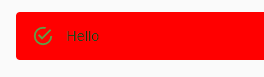
Within your theme.css file, you could override all success Alerts’ background color by creating a style sheet like this.
.MuiAlert-standardSuccess { background-color: red !important; }
Now, if you create an alert within your dashboard, it will be red.
New-UDStyle is a component that is included with PSU starting with version 1.5.11. If you are running a version prior to this, it’s available on the PowerShell Gallery. New-UDStyle allows you to style individual components or sections of components. You may want a button to be a particular color or an alert to be red. Using this method will not style all components through the dashboard like a cascading style sheet but just the components that are included in the -Content script block of New-UDStyle.
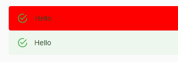
We can use the previous example of the red alert but only apply it to a single alert rather than to all alerts. You will first need to ensure that you have added the UniversalDashboard.Style component to your dashboard.
Within your dashboard script, create a new style and apply the same style sheet and wrap the alert in New-UDStyle.
New-UDStyle -Style '.MuiAlert-standardSuccess { background-color: red !important;  }  ' -Content {
    New-UDAlert -Text "Hello"
}
New-UDAlert -Text "Hello"
You’ll notice that it will have the same effect as the CSS file but will only style the first alert.
In this article, we went over how to use various methods to style and theme your dashboard. The theme engine can be used for basic styling while cascading style sheets and New-UDStyle can be used for more control of the look and feel of your dashboard.
Continue the conversion on the Ironman Software forums. Chat with over 1000 users about PowerShell, PowerShell Universal, and PowerShell Pro Tools.